It’s 8:15 on a Monday morning and a potential customer is standing on a packed train in Manchester, thumb-scrolling through search results for the exact service you sell. They tap your website. The menu overlaps your logo, the buttons are too small to press and the text runs off the edge of the screen. Three seconds later they are on a competitor’s site, which loads cleanly and lets them book in two taps.
That moment plays out thousands of times a day across the country, and it is the reason why picking the right responsive web design company UK businesses can trust is one of the most valuable decisions you will make for your online presence. In this guide we explain what responsive design really involves, what separates a great agency from an average one, and the costly mistakes that quietly drain enquiries every single month.
What Does a Responsive Web Design Company in the UK Actually Do?
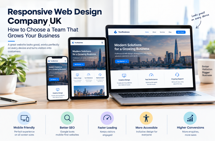
Responsive web design means building one website that automatically adapts its layout, images and navigation to whatever screen is looking at it, whether that is a 6-inch phone, a tablet, a laptop or a 32-inch monitor. A good responsive web design company UK clients can rely on does far more than shrink a desktop layout. It rethinks the experience for every device so that people can read, tap, scroll and buy without friction.
The Three Building Blocks of Responsive Design
Every well-built responsive site rests on the same technical foundations. Understanding them helps you ask sharper questions when you speak to agencies.
Fluid Grids
Instead of fixed pixel widths, fluid grids use proportions. A column that takes up one third of the screen on a desktop will stack neatly above the next column on a phone, keeping content readable at any width.
Flexible Images and Media
Images, videos and embedded maps scale within their containers so they never spill off the screen. Modern techniques also serve smaller image files to mobile visitors, which protects loading speed on slower connections.
Smart Breakpoints
Breakpoints are the screen widths where the layout changes. Experienced designers set them where the content starts to look awkward rather than at a handful of popular device sizes, which is why a site stays tidy on devices that did not even exist when it was built. If you enjoy the technical detail, the MDN responsive design guide is an excellent free reference.
Responsive Design vs a Separate Mobile Website
Some older businesses still run a separate mobile site on an address such as m.yourbusiness.co.uk. This approach doubles your maintenance work, splits your SEO value across two sites and often leaves content missing on the mobile version. A single responsive website is easier to update, cheaper to look after and far friendlier to search engines.
Why Responsive Design Matters for UK Businesses in 2026
UK shoppers research, compare and buy from their phones constantly, often while doing something else. If your site gets in their way, they simply leave. Here are the three biggest reasons responsiveness now sits at the heart of every successful website project.
Google Ranks the Mobile Version of Your Site
Google primarily uses the mobile version of a page for indexing and ranking, a practice explained in detail in Google’s mobile-first indexing documentation. If your mobile experience is thin, slow or broken, your rankings can suffer even when your desktop site looks perfect.
What This Means in Practice
- Your mobile pages need the same important content as your desktop pages.
- Headings, structured data and meta information must match across devices.
- Menus and internal links should be easy to reach with a thumb.
Speed and Core Web Vitals
Page experience metrics such as loading speed, interactivity and visual stability are measured by Google as Core Web Vitals, and you can read the official definitions on web.dev. A responsive build that uses optimised images, lean code and sensible hosting gives you a head start on all three.
Accessibility and Inclusive Design
Responsive layouts naturally support people who zoom text, use screen readers or browse with larger fonts. Following the Web Content Accessibility Guidelines also helps UK organisations meet their obligations under the Equality Act while widening the audience who can actually use their website.
Signs You Have Found a Genuinely Good Responsive Web Design Company
Almost every agency claims to build mobile-friendly websites. These practical checks help you separate genuine expertise from marketing talk.
They Test on Real Devices, Not Just Browser Resizing
Dragging a browser window narrower is a useful quick check, but it cannot reproduce how a real phone handles touch gestures, notches, on-screen keyboards or patchy 4G. Ask any agency which physical devices and browsers they test on before launch.
Their Portfolio Shows Real Results
Look for finished projects across different industries and ask how those sites perform on mobile. You can see how we approach this in our case studies, including the Home Decor UK eCommerce build, where product browsing and checkout had to feel effortless on a phone.
They Choose the Right Platform for Your Goals
A brochure site, an online shop and a membership platform all have different needs. A capable team will recommend the right tool rather than forcing everything into one system.
Popular Options Worth Discussing
- Flexible, editable business websites through WordPress development.
- Fast-launch online stores through Shopify development.
- Highly customisable shops for WordPress users through WooCommerce web development.
Their Pricing Is Clear and Honest
Beware of quotes that are vague about what is included. A trustworthy agency explains the scope, the number of pages, revisions, testing and what happens after launch. You can review our transparent pricing plans to see what a clearly structured package looks like.
How a Professional Responsive Design Process Works
A structured process is the best predictor of a smooth project. At Web Design Agency UK we follow four clear phases, so you always know what is happening and what comes next.
Step 1: Info Gathering
We start by learning about your business, customers, competitors and goals. We also review your analytics to understand which devices your visitors actually use, because the data often changes our design priorities.
Step 2: Idea Planning
Next we map your sitemap and sketch layouts for mobile first, then scale up to larger screens. Planning small screens first forces us to focus on what matters most to your visitors.
Step 3: Design Analysis
We refine the visual design, review typography, colour contrast and button sizes, and check each page against real user journeys such as booking, calling or buying.
Step 4: Testing and Launch
Before going live we test across browsers and devices, check speed and fix any rough edges. After launch, ongoing website maintenance keeps everything secure, updated and performing well.
Common Responsive Design Mistakes That Cost You Customers
Even good-looking websites can fail on mobile. These are the problems we see most often when auditing sites for new clients.
Tiny Tap Targets and Crowded Menus
Buttons and links placed too close together lead to accidental taps and frustration. Aim for comfortable spacing and a simple, clear mobile menu.
Heavy Images and Slow Pages
Uncompressed photos are the number one cause of sluggish mobile pages. Properly sized and compressed images can transform loading times without any visible loss of quality.
Hidden Calls to Action
If your phone number, quote form or booking button sits far down the page on mobile, you are making it harder for ready-to-buy visitors to contact you.
Pop-ups That Block the Screen
Full-screen pop-ups are especially irritating on small screens and can also harm your search performance. Use unobtrusive banners and give visitors an easy way to close them.
Responsive Design and SEO: A Partnership That Pays Off
A beautiful site that nobody finds is a missed opportunity. The strongest results come when design and visibility are planned together from day one. Combining a responsive build with professional search engine optimization means your structure, content, page speed and technical setup all support your rankings.
Where Design Meets Search Visibility
- Clean heading structure that helps both readers and search engines.
- Fast-loading templates that respect Core Web Vitals.
- Mobile-friendly navigation that keeps visitors browsing longer.
- Clear calls to action that turn visits into enquiries.
Questions to Ask Before You Hire a Responsive Web Design Company
Bring this short list to your first call. The answers will tell you a great deal about how the agency works.
About Their Process
- Do you design mobile first or desktop first?
- How many design revisions are included?
- Which devices and browsers do you test on?
About Support After Launch
- Who looks after updates, backups and security?
- How quickly do you respond to support requests?
- Can you help with hosting and domain services if we need them?
Ready to Build a Website That Works on Every Screen?
Choosing a responsive web design company in the UK is about more than a fresh look. It is about giving every visitor a fast, clear and effortless experience, whichever device they happen to hold. With more than 749 websites delivered and over eight years of experience, our London-based team has helped businesses of every size turn browsers into customers.
When you are ready to talk, contact our team for a free, no-obligation consultation, or call us on 020 8429 5297.
Over to you: when did you last open your own website on your phone and try to complete a purchase or enquiry? Share what you found in the comments, and tell us the one thing you would fix first.
Frequently Asked Questions
1. What is a responsive web design company?
A responsive web design company builds websites that automatically adjust their layout, images and navigation to suit any screen size, from smartphones and tablets to laptops and large desktop monitors. This gives every visitor a smooth experience and supports better search visibility.
2. How much does responsive web design cost in the UK?
Costs depend on the number of pages, custom features, eCommerce needs and integrations. A simple business website costs far less than a bespoke online store. Reviewing clear pricing plans and requesting a tailored quotation is the best way to get an accurate figure.
3. How long does it take to build a responsive website?
A standard business website can often be completed within a few weeks, while larger eCommerce or custom projects need more time. Timelines depend on how quickly content and feedback are provided during the design stages.
4. Is responsive design better for SEO?
Yes. Google primarily uses the mobile version of your pages for indexing and ranking, so a responsive site that loads quickly and shows the same content on every device gives you a stronger SEO foundation than a separate mobile site.
5. Can you make my existing website responsive?
In most cases, yes. An existing website can be redesigned or rebuilt to improve mobile layout, speed, usability and conversion potential. Our team will audit your current site and recommend whether a redesign or a full rebuild is the better option.